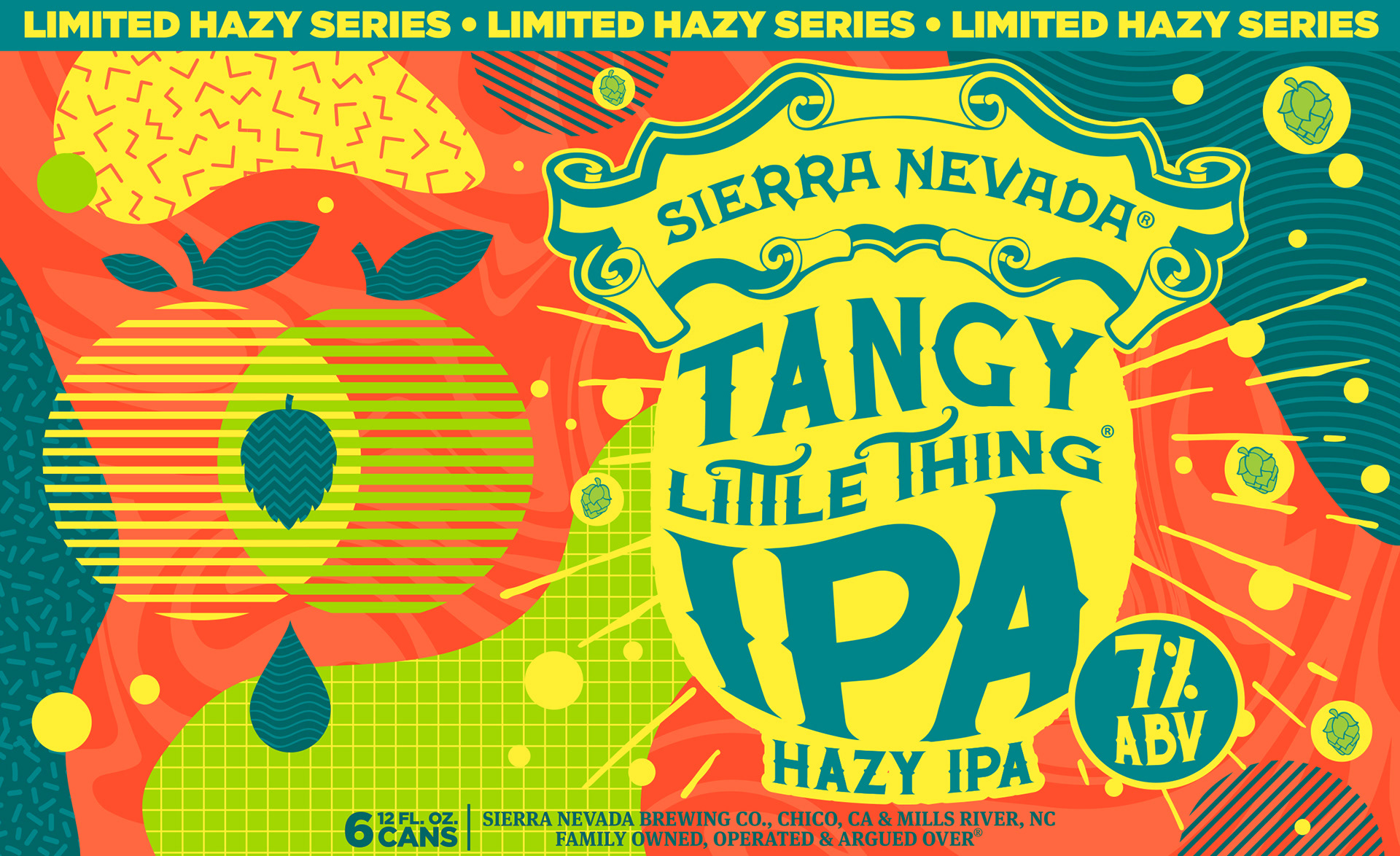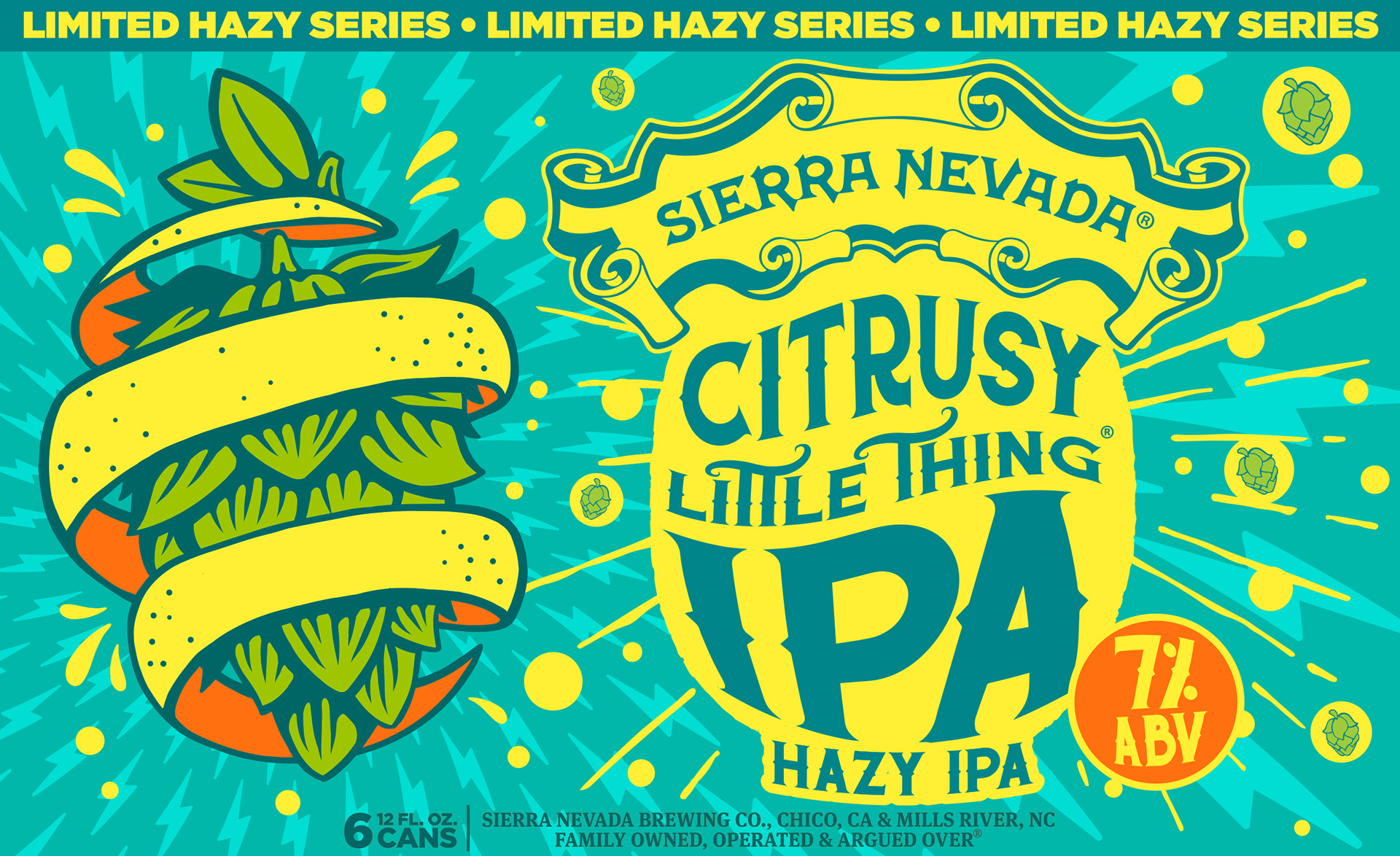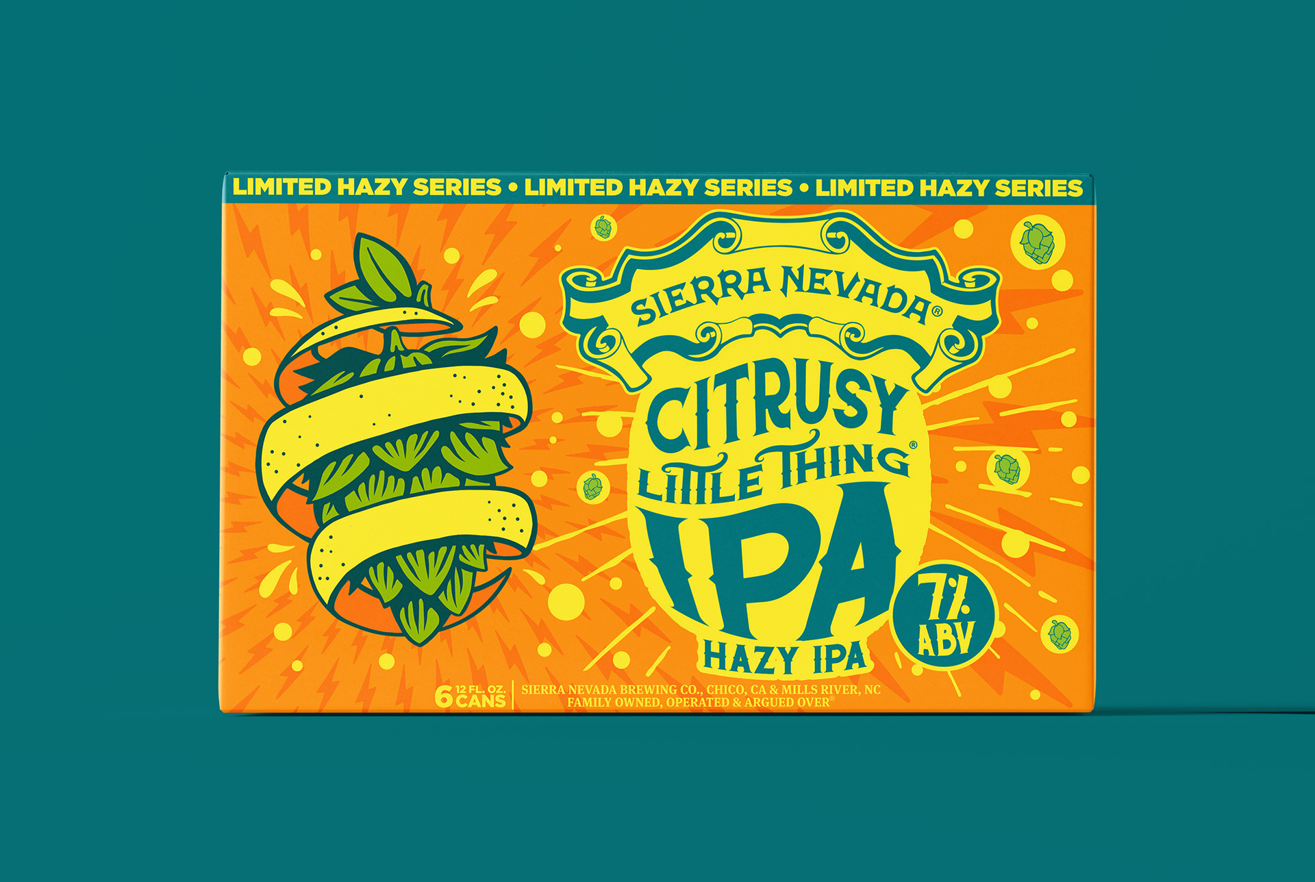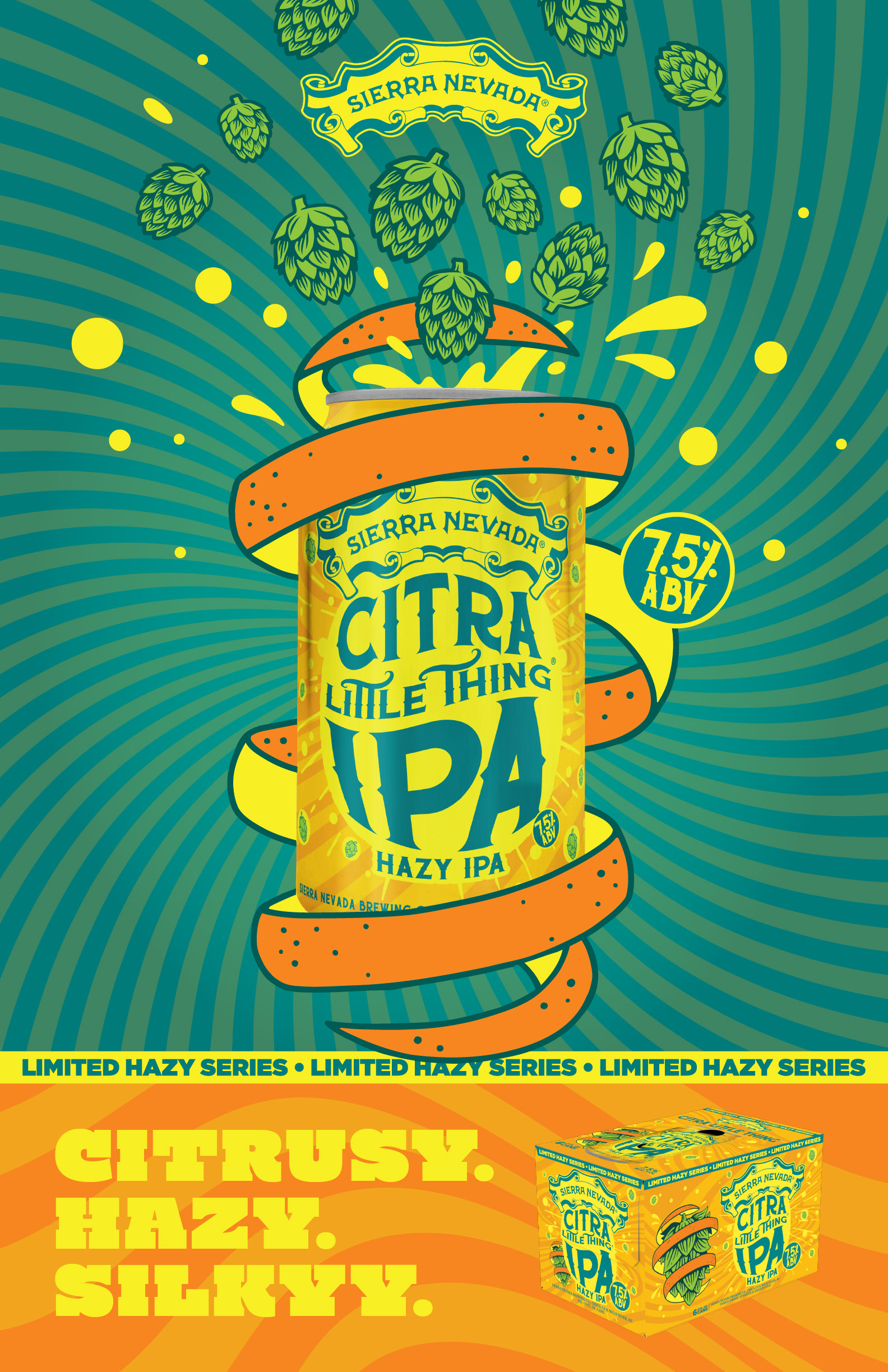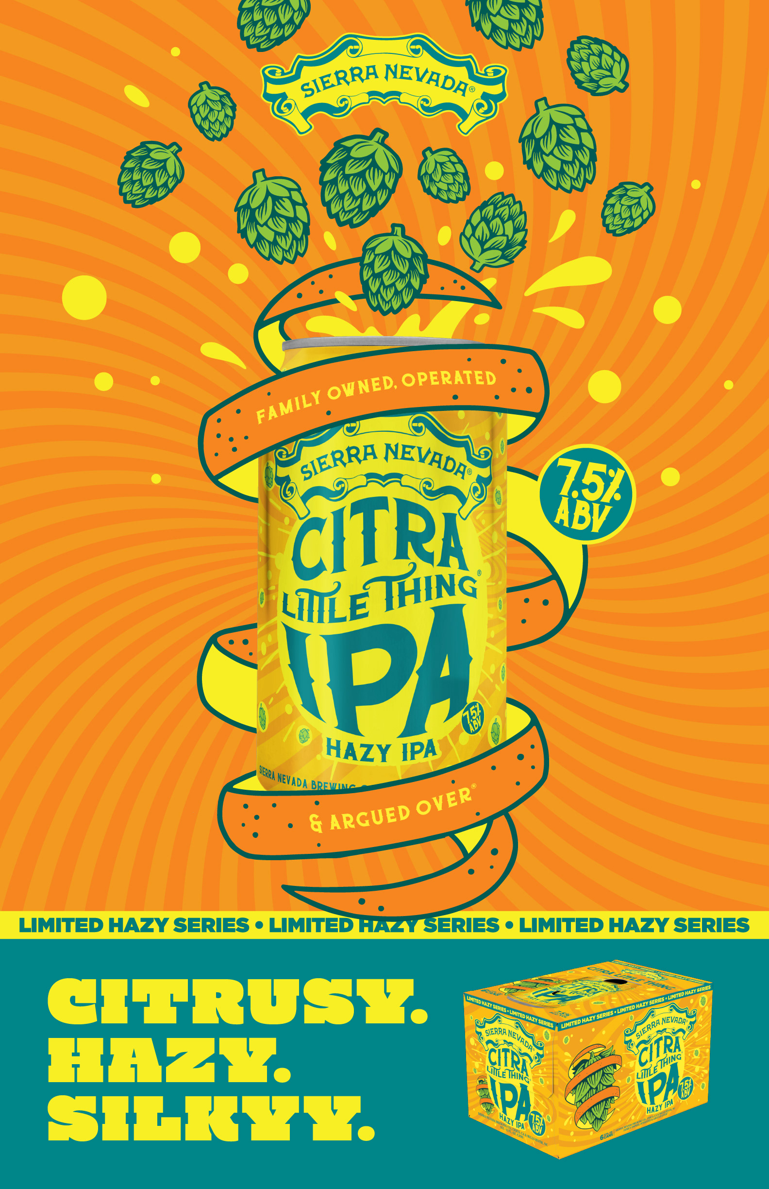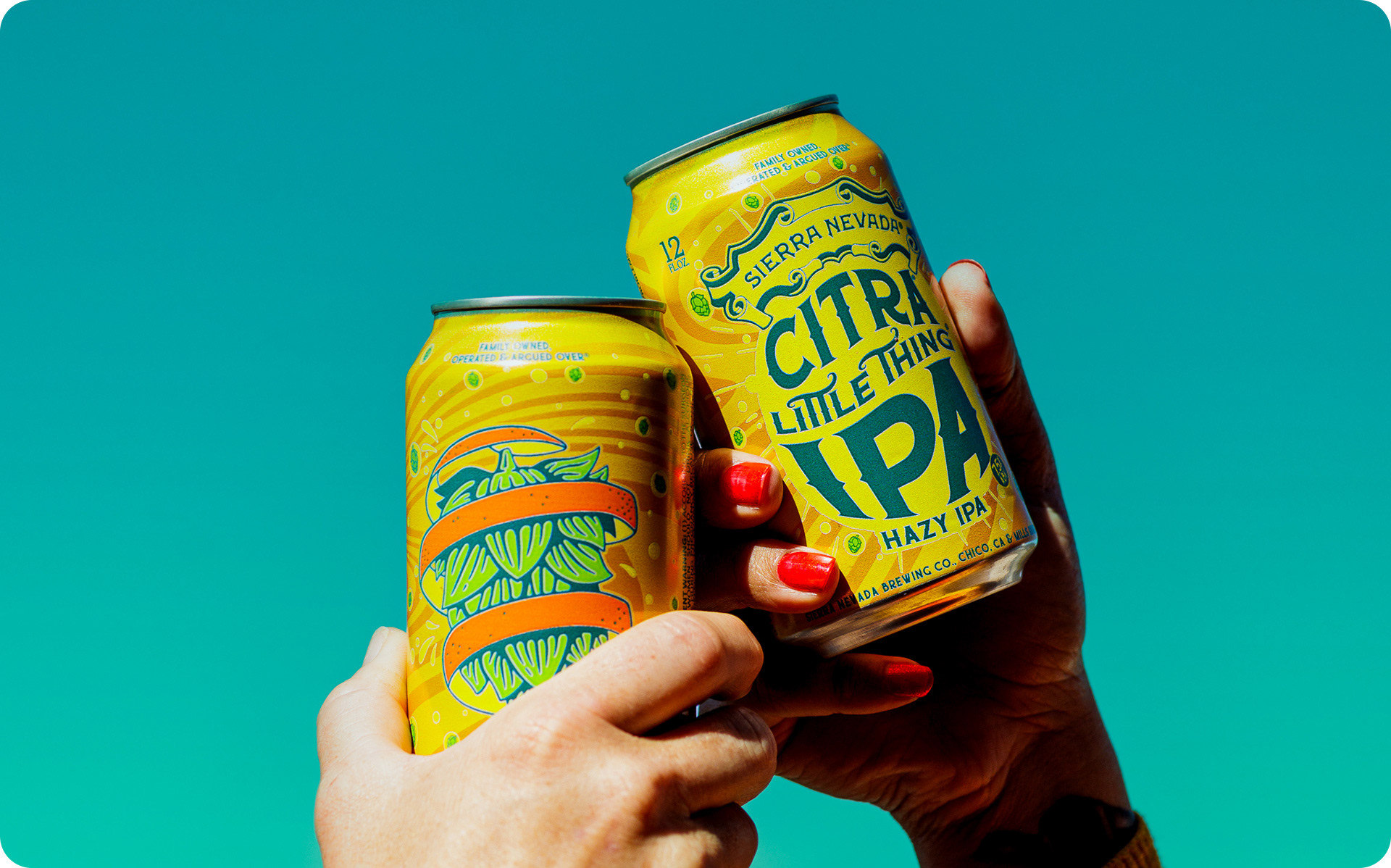
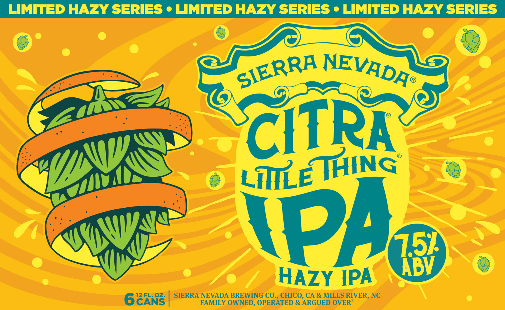
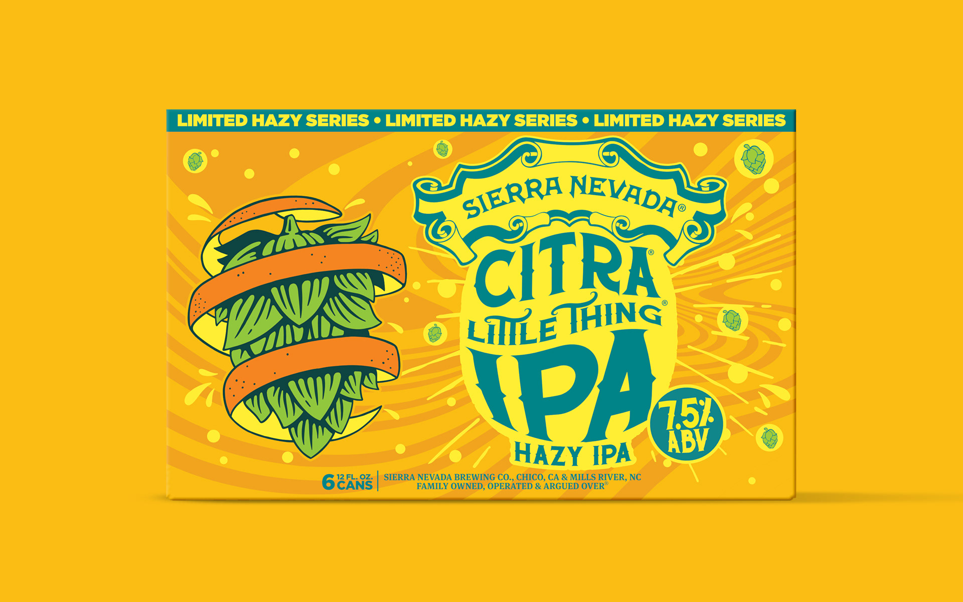
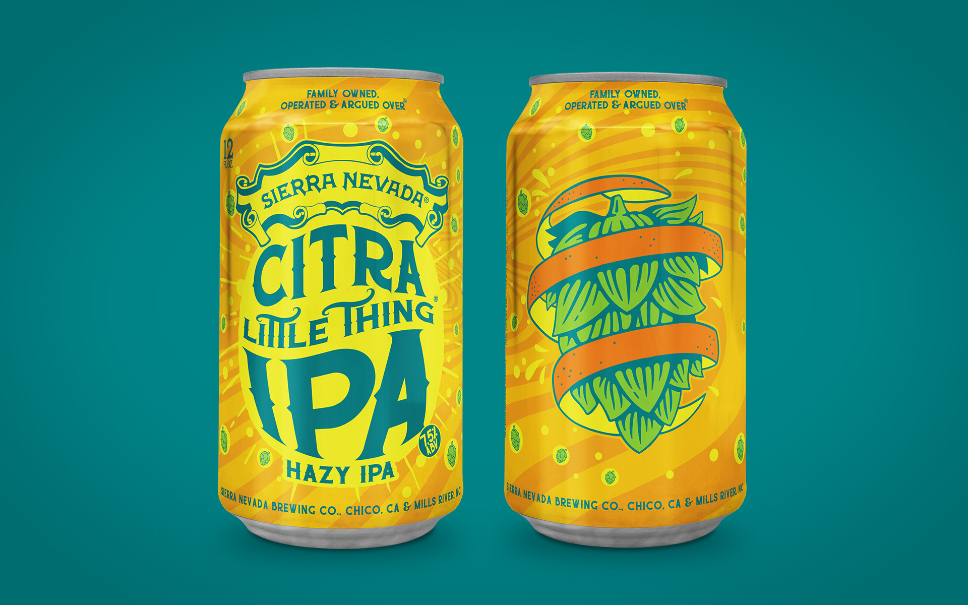
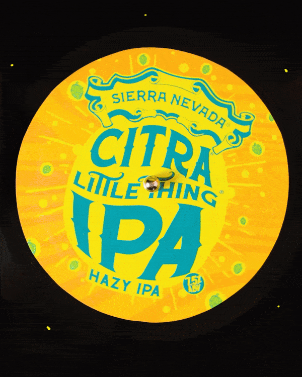
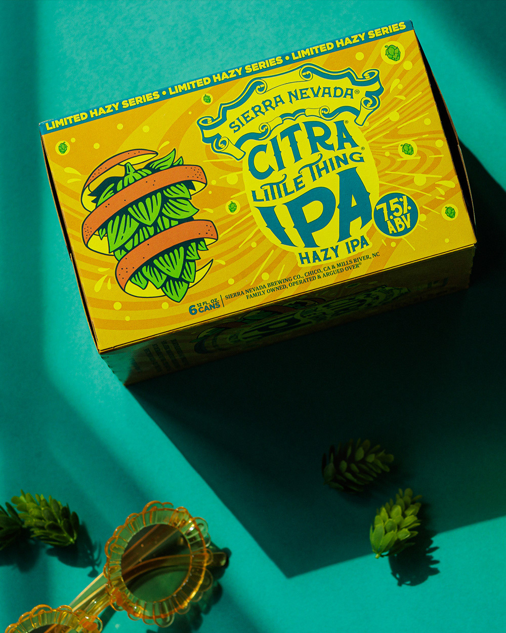
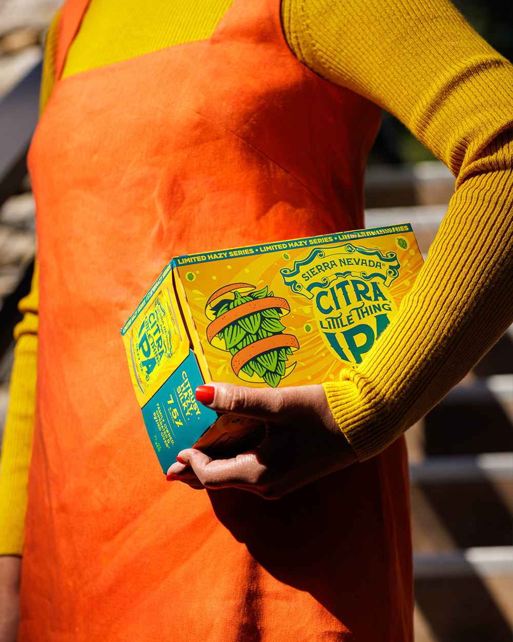
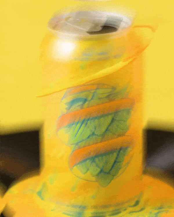
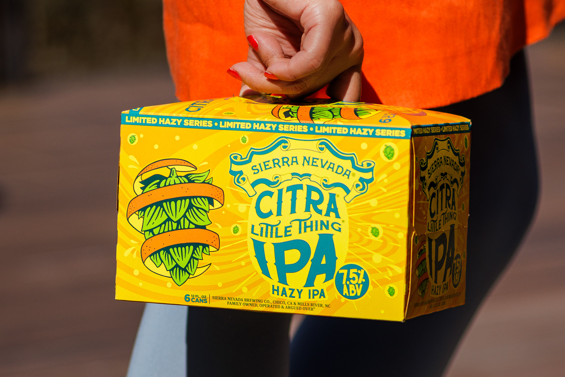
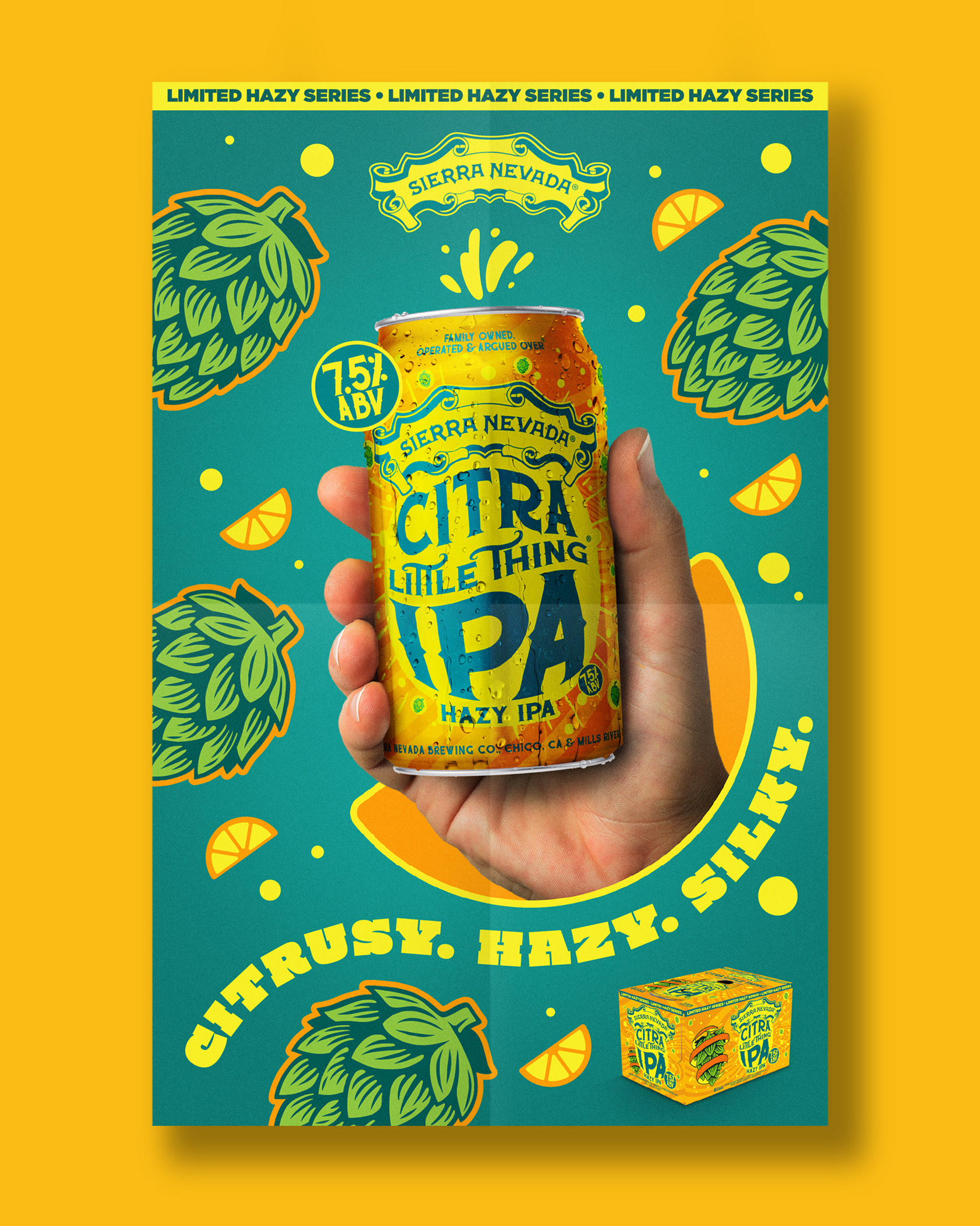
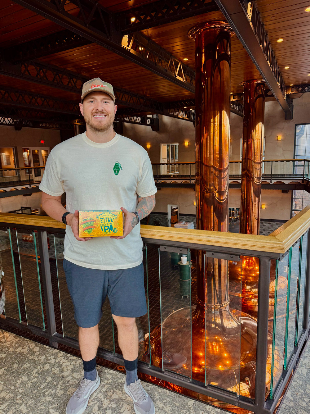
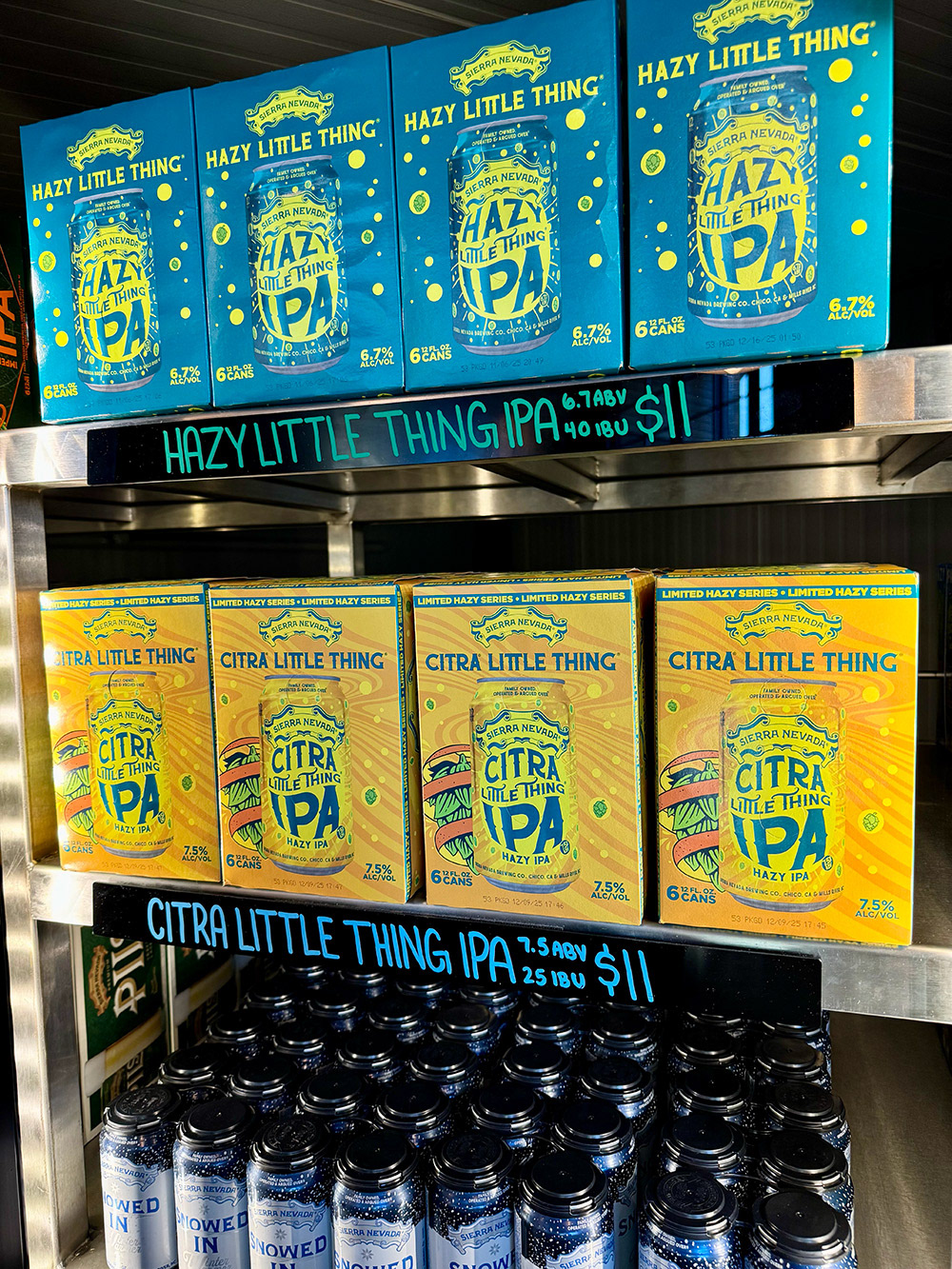
CITRA LITTLE THING IPA
For Sierra Nevada’s Citra Little Thing IPA, I designed a cohesive packaging and retail system inspired by electro-funk rhythms, spinning vinyl, and the bright citrus character of Citra hops. Working within the established Hazy Little Thing aesthetic, the goal was to introduce a fresh, energetic expression while preserving strong shelf recognition.
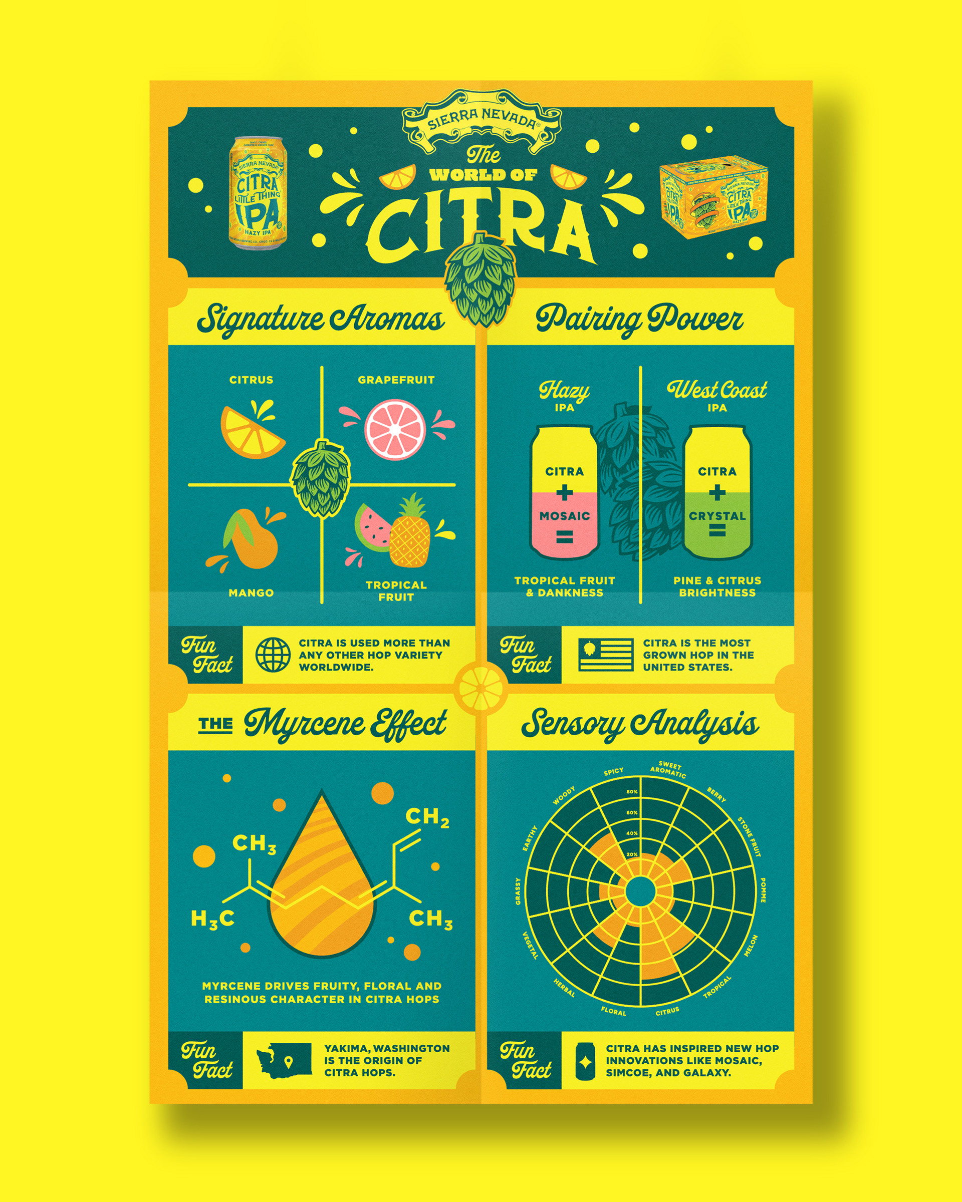
The visual language uses fluid forms, bold color, and a sense of movement to reflect the beer’s smooth texture and layered orange and grapefruit flavor. The work extends beyond the can to include educational infographics focused on the Citra hop, along with a flexible in-store poster template built to support future releases across the Little Thing lineup.
CLIENT:
SIERRA NEVADA BREWING COMPANY
SIERRA NEVADA BREWING COMPANY
TEAM:
ASHLEY TROUTMAN - ART Director
Dustin Avilla - Senior Graphic Designer
ASHLEY TROUTMAN - ART Director
Dustin Avilla - Senior Graphic Designer
SCOPE:
PACKAGING, ILLUSTRATION, INFOGRAPHICS, SOCIAL GRAPHICS
PACKAGING, ILLUSTRATION, INFOGRAPHICS, SOCIAL GRAPHICS


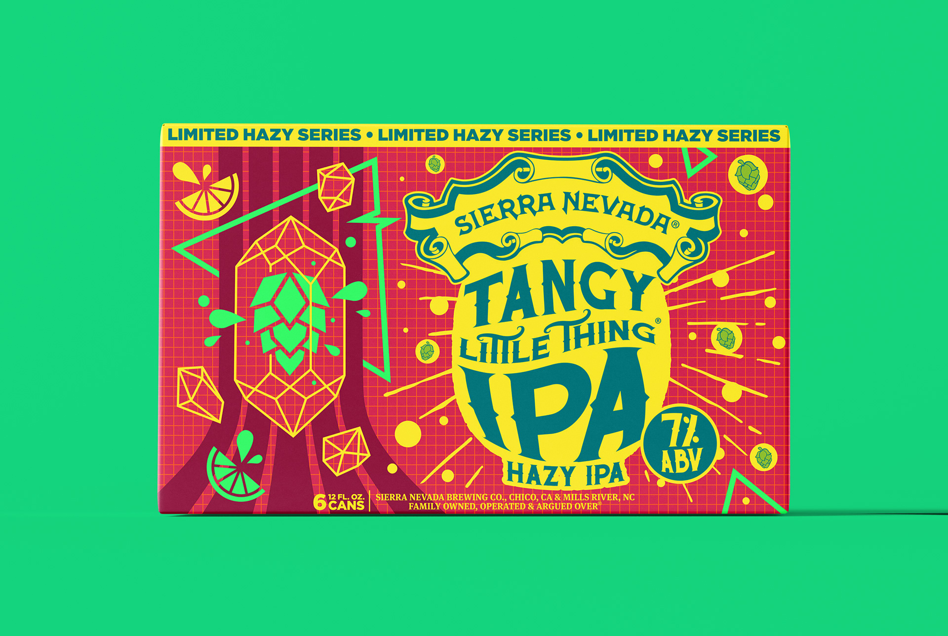
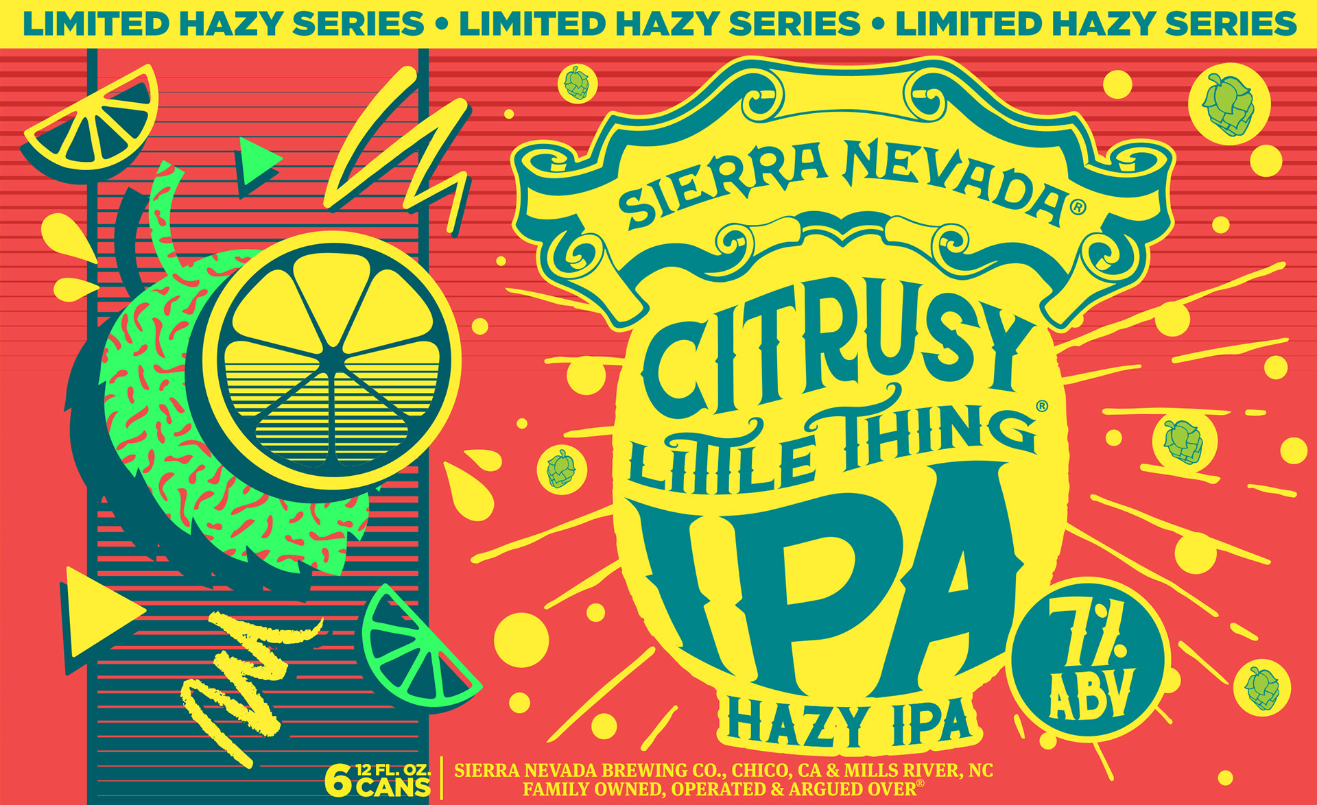
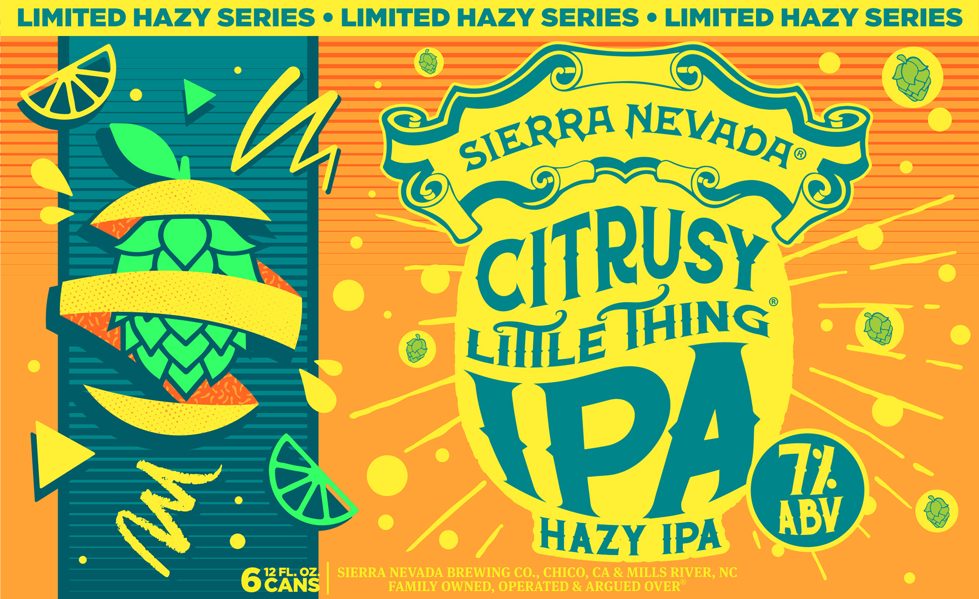
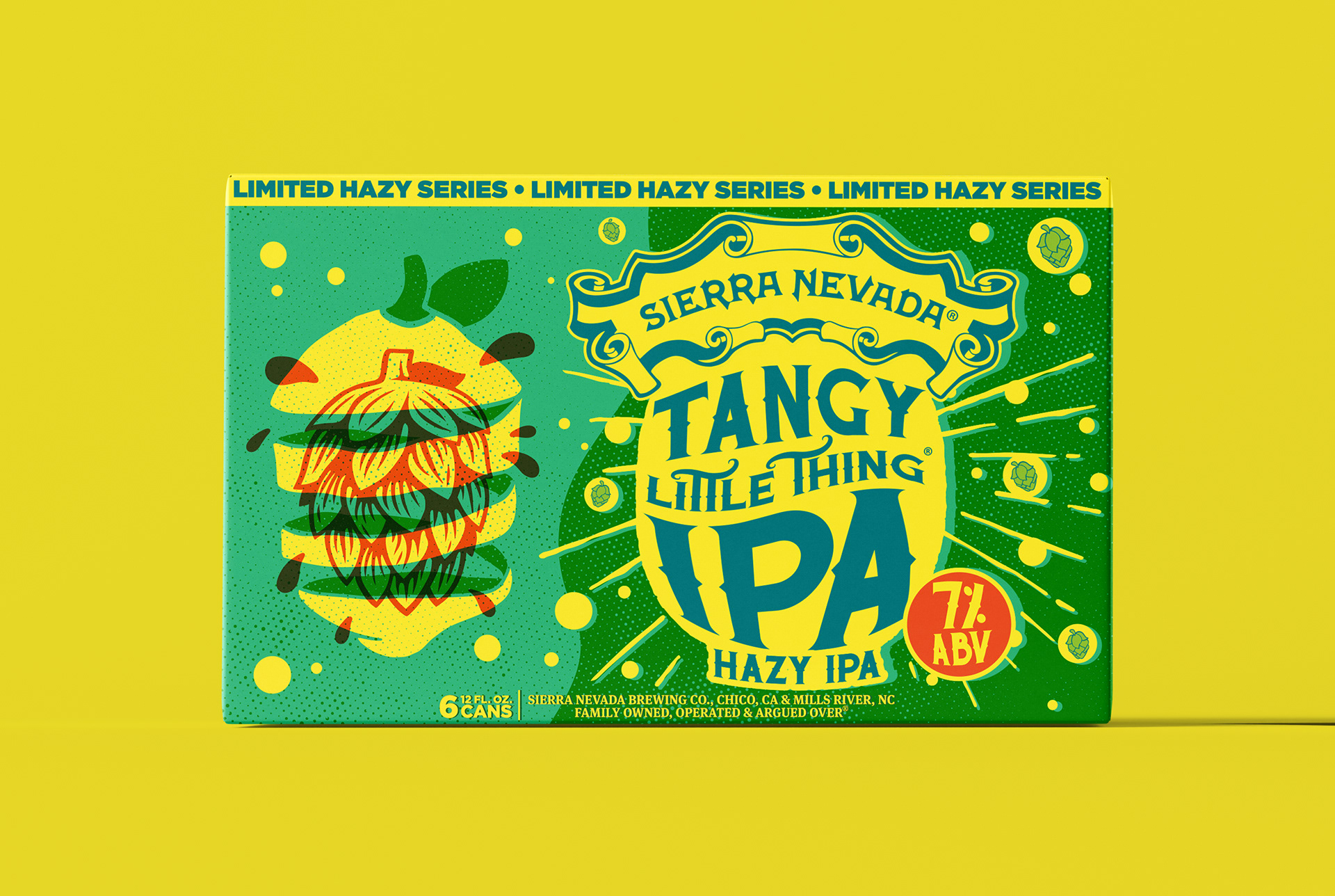
ADDITIONAL CONCEPT EXPLORATION
Early in the process, multiple creative directions were explored for the packaging hero graphic, color palette, and background pattern. These studies tested how far the visual system could stretch within the Hazy Little Thing framework, experimenting with contrast, rhythm, and composition to understand what best supported the flavor story and shelf impact. While not all directions moved forward, each exploration helped refine the final approach and clarify the balance between brand consistency and creative expression.