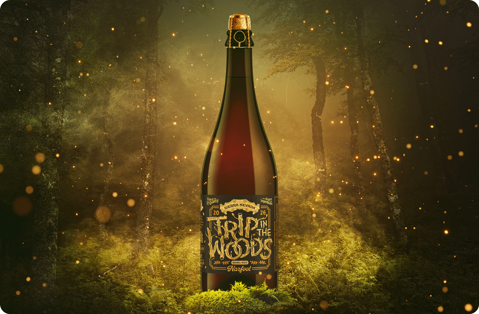
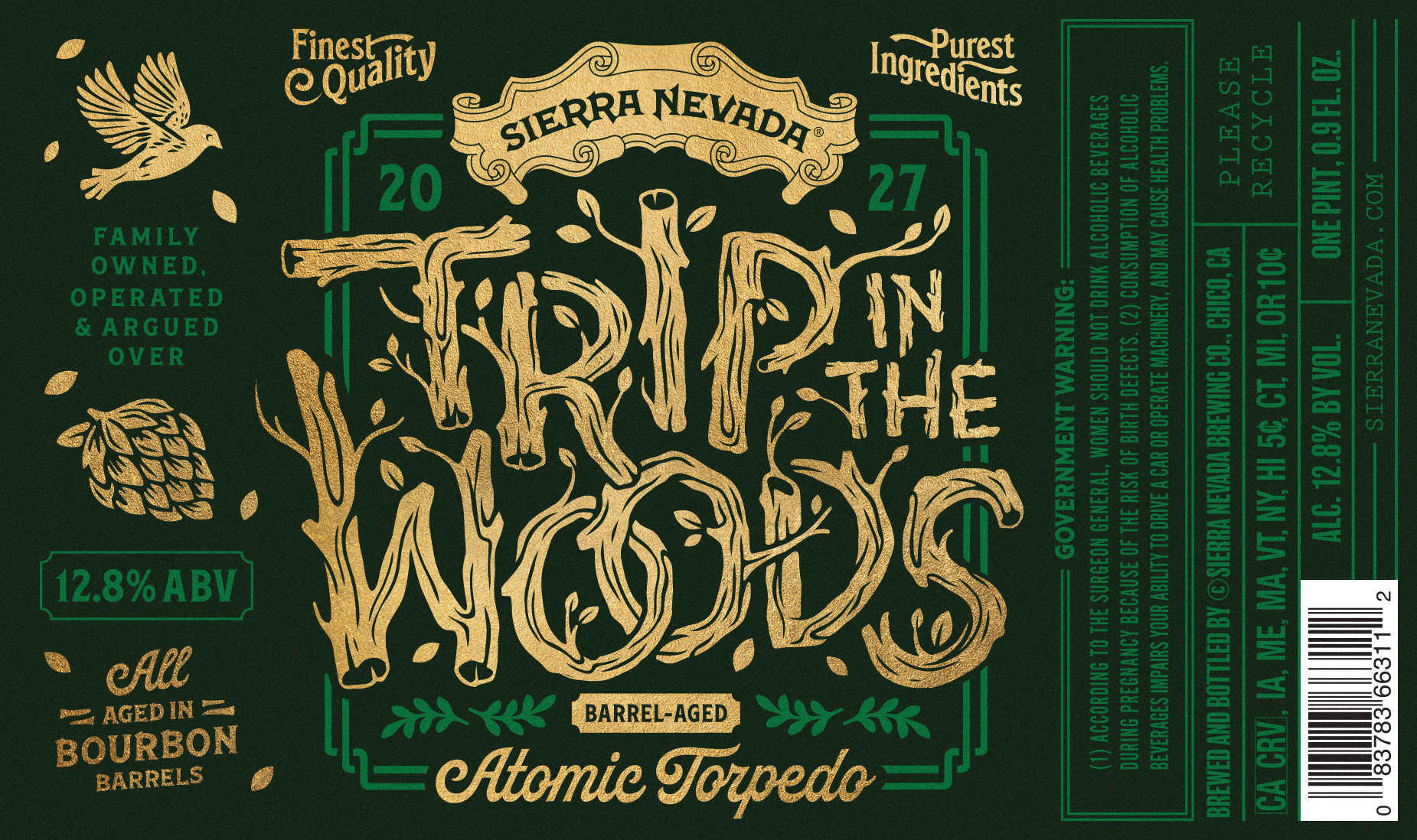
TRIP IN THE WOODS BARREL-AGED SERIES
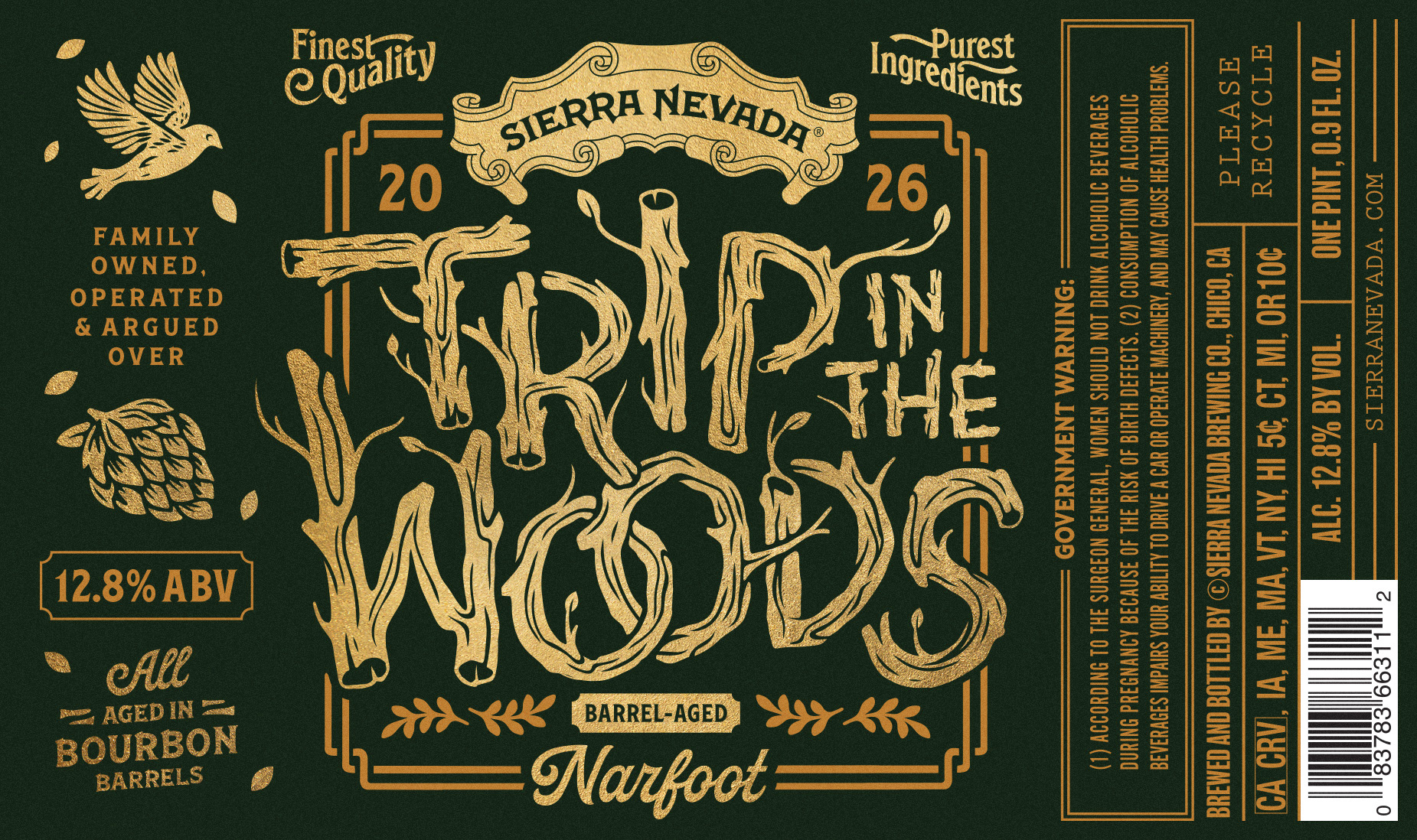
I teamed up with Sierra Nevada Brewing to create packaging options for their latest Friends of the Family Club release — Trip in the Woods: a Bourbon Barrel-Aged Ale.
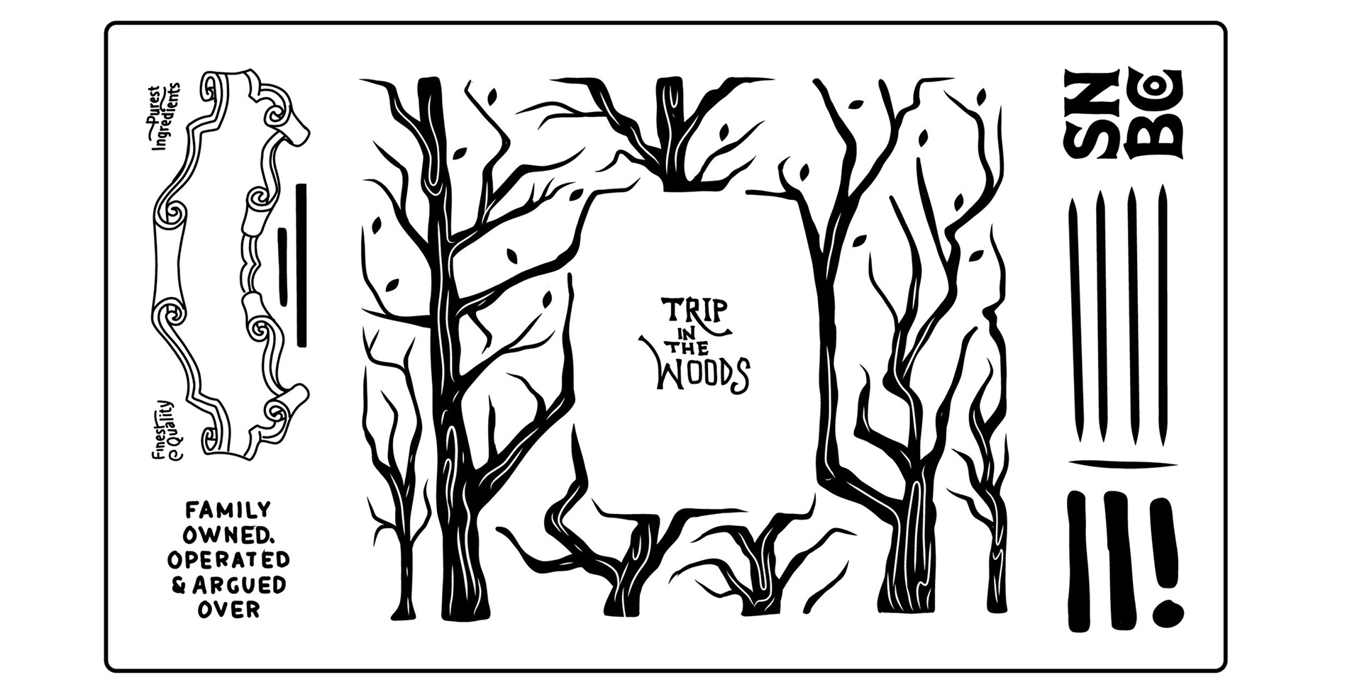
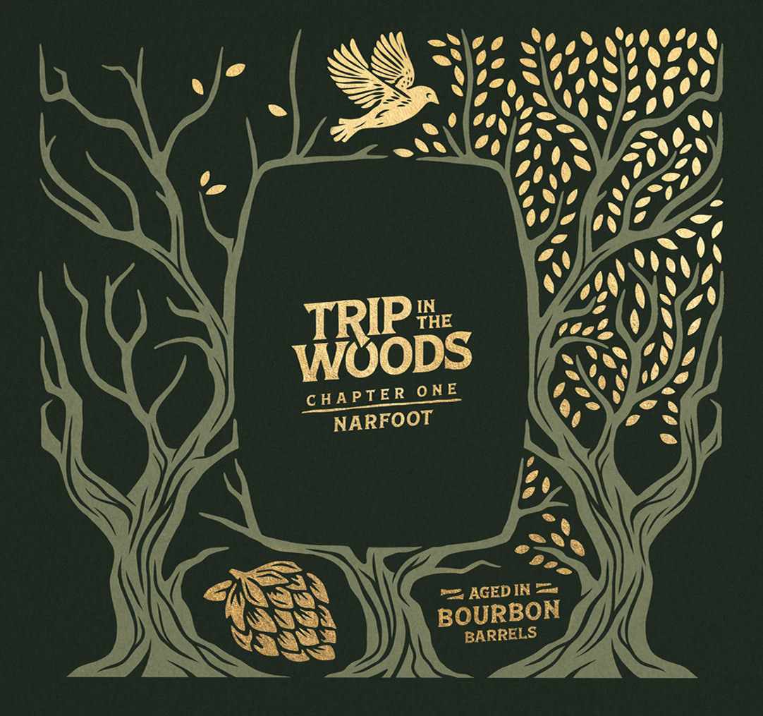
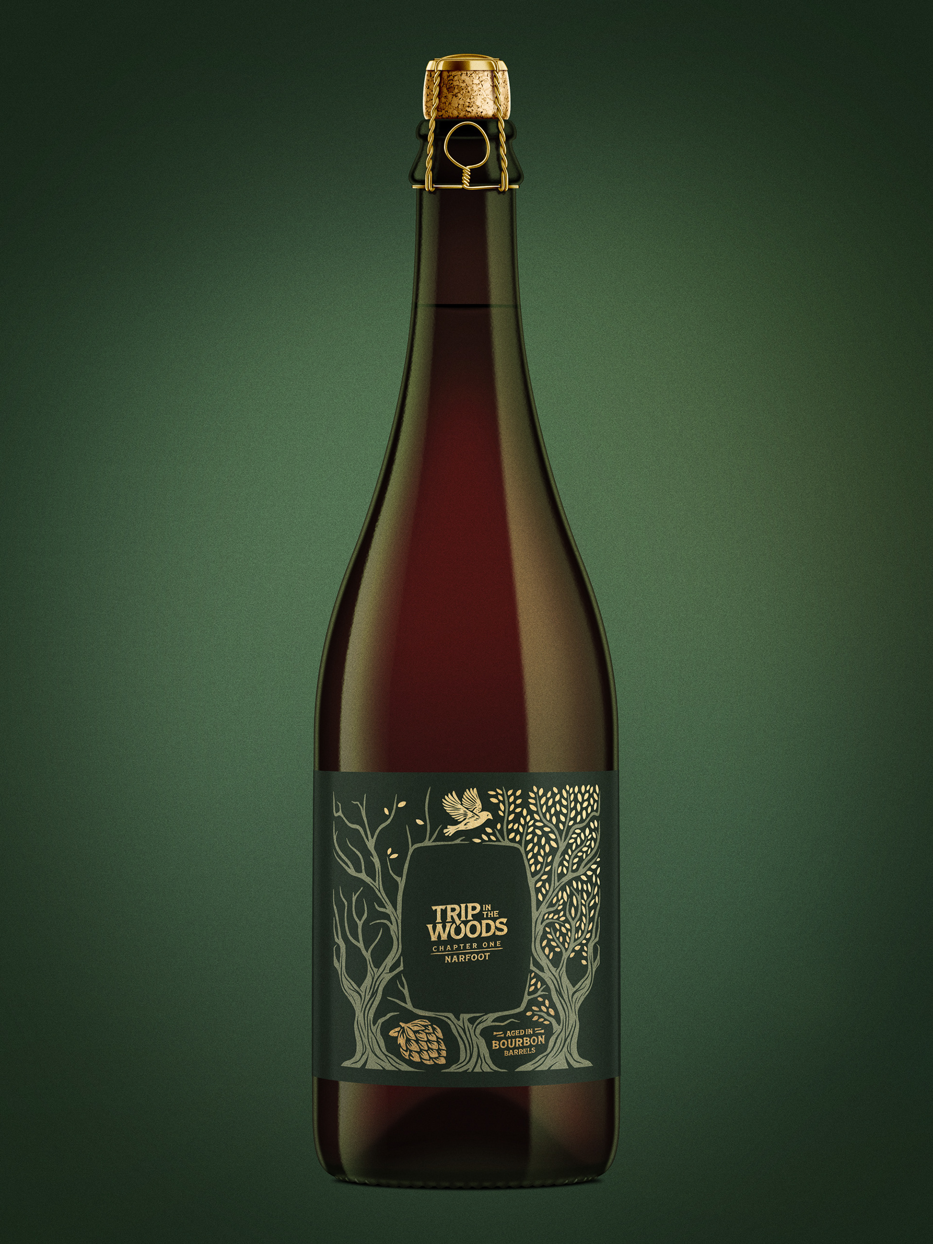
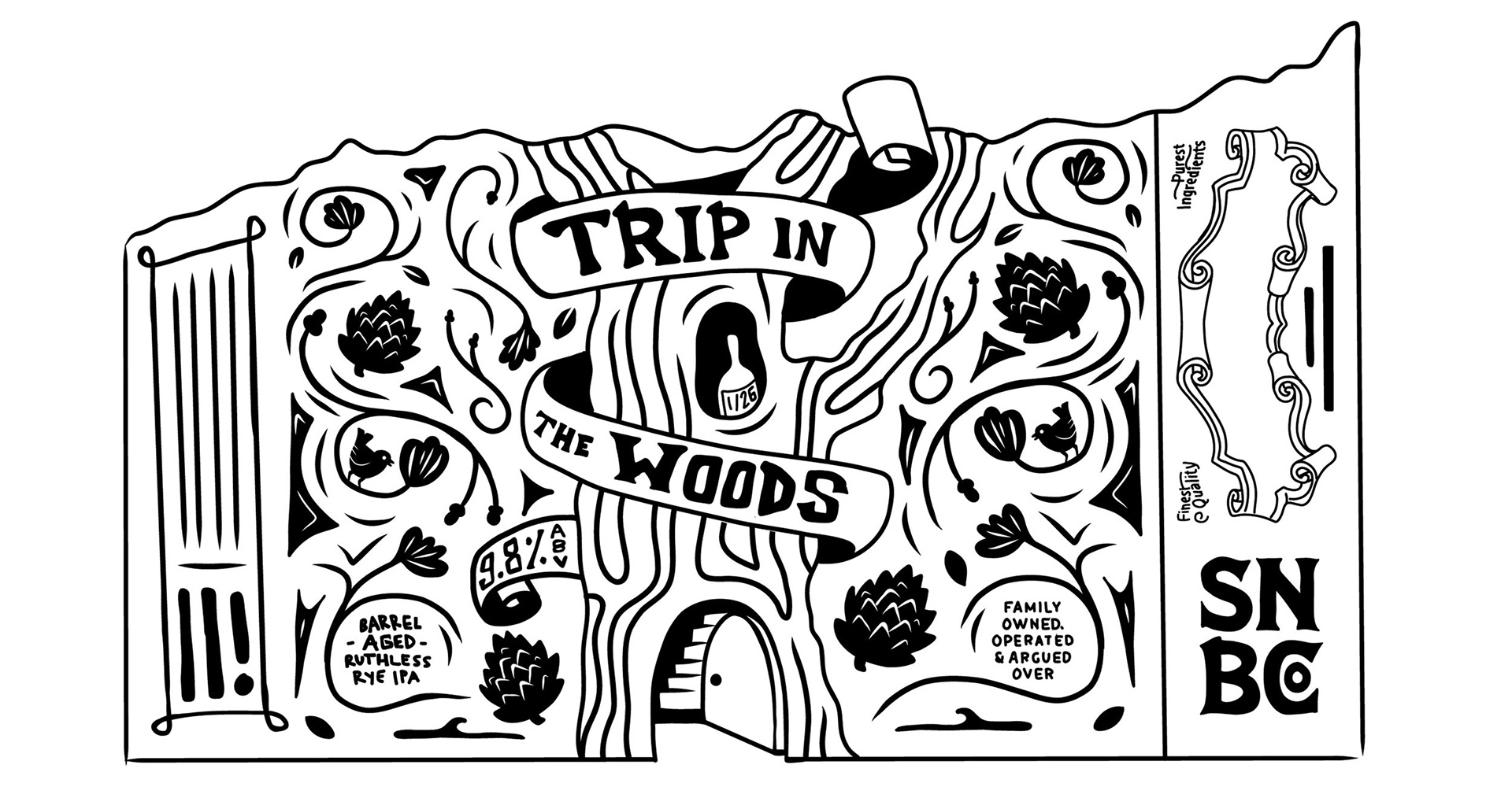
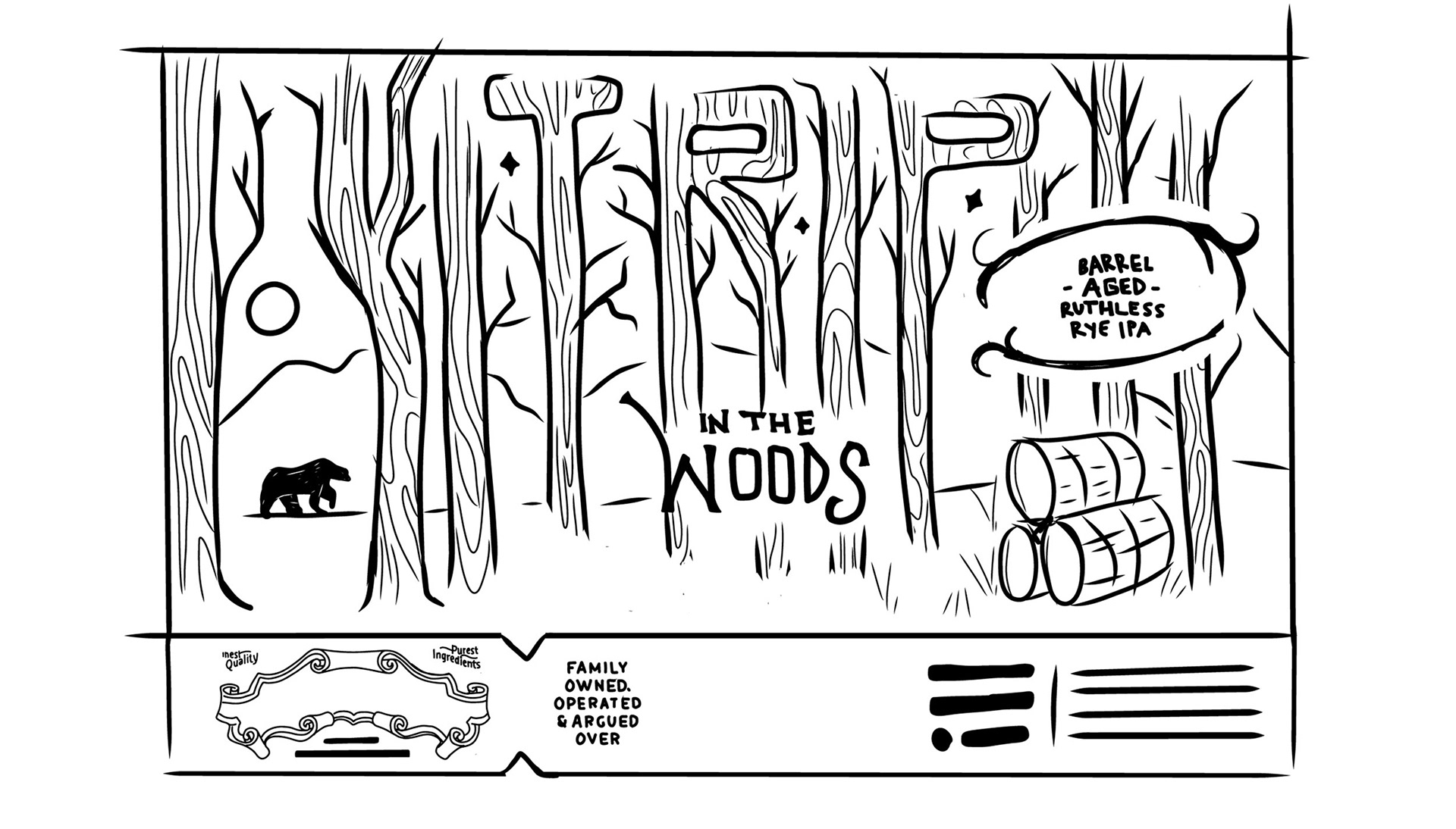
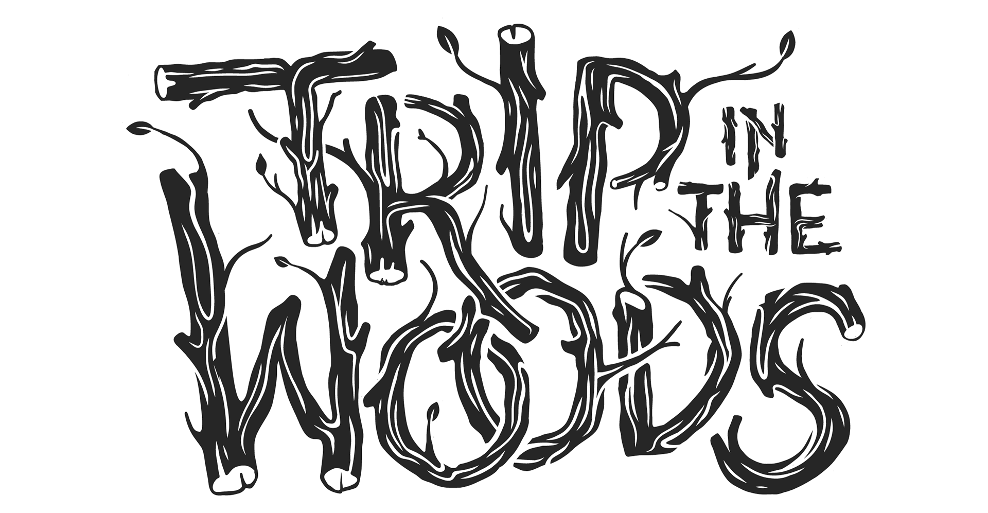
These brews are rare, small-batch treasures available exclusively to club members. Building on the Trip in the Woods theme, we set out to capture a sense of curiosity and storytelling — layering wood textures, hidden Easter eggs, and foliage details that evolve from label to label.
We pulled inspiration from old fairytale book covers, intricate wood carvings, and classic whisky bottle designs, then layered in foil stamping and embossing to create a label that feels both crafted and collectible, worthy of a spot on the mantle.
CLIENT:
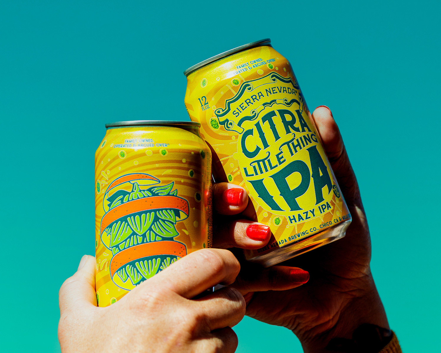
SIERRA NEVADA BREWING COMPANY
SIERRA NEVADA BREWING COMPANY
TEAM:
ASHLEY TROUTMAN - ART Director
Dustin Avilla - Senior Graphic Designer
ASHLEY TROUTMAN - ART Director
Dustin Avilla - Senior Graphic Designer
SCOPE:
PACKAGING, ILLUSTRATION
PACKAGING, ILLUSTRATION
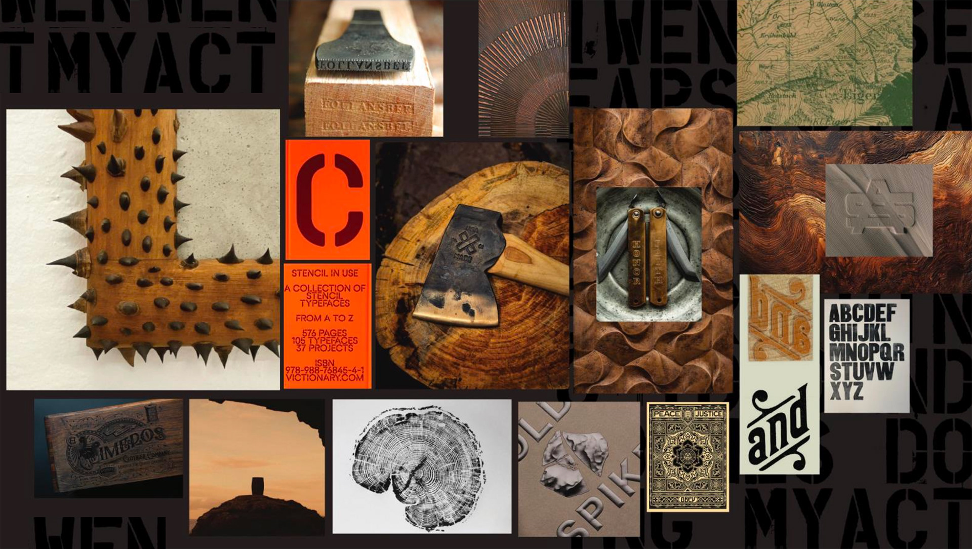
ADDITIONAL EXPLORATION
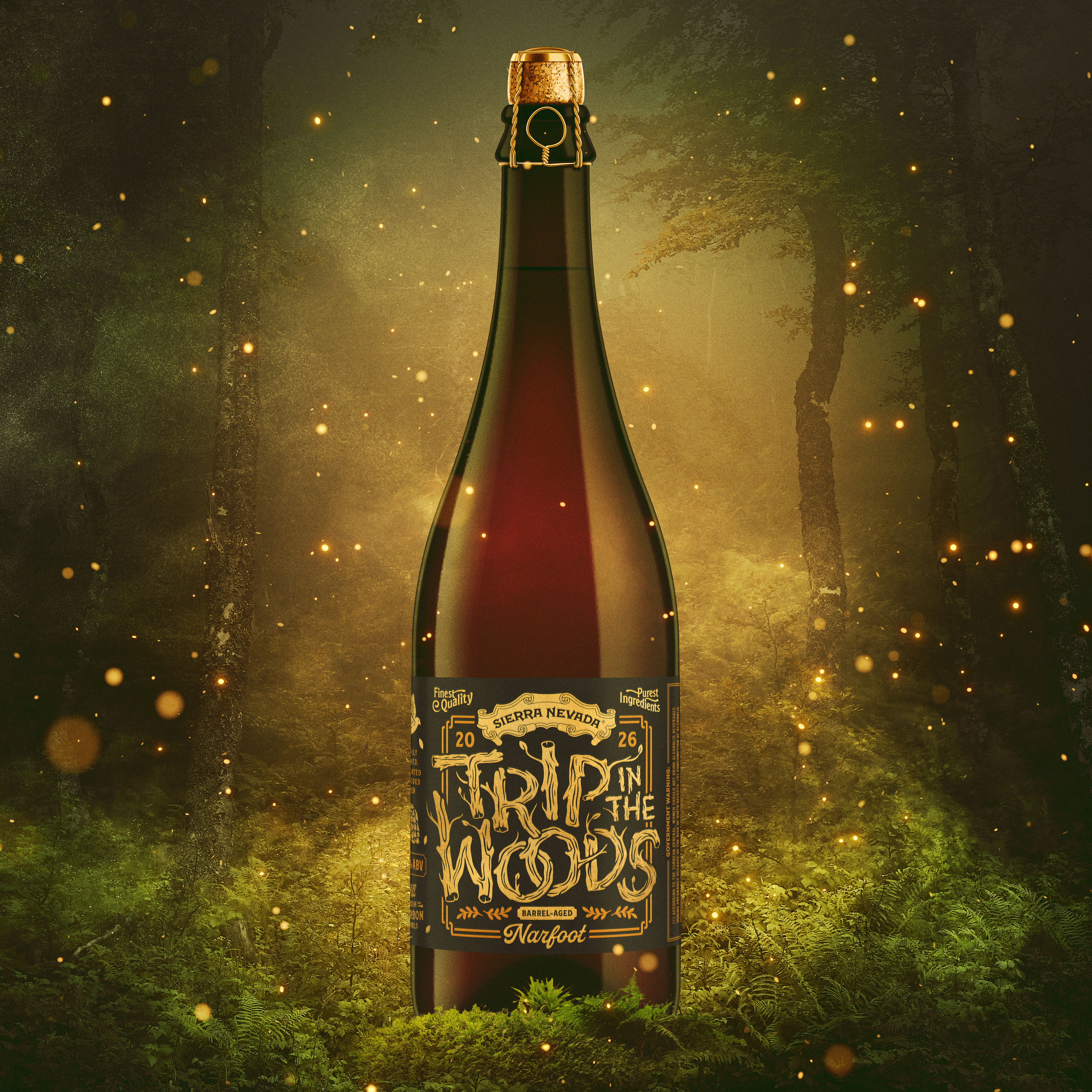
Drawing inspiration from the surrounding forest, a void is formed in the shape of a barrel, using the branches and foliage as framing elements. The denser foliage surrounding the barrel reflects the passage of time and the aging process that occurs within. The final label concept would feature a matte metallic foil stamp, adding a subtle shine to elevate the overall look and tactile quality of the design.